

Simple Tips for Designing Garden Color Schemes
gardening projects
garden inspiration

Written by Nancy J. Ondra / Photographs by Rob Cardillo
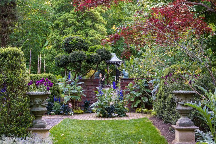
Creating a memorable garden isn’t about having the rarest plants or an unlimited budget for arbors and walkways. A collection of obscure species or cutting-edge cultivars may be uninteresting to all but the most ardent specialists, and visitors who expect gardens to focus on plants may be unimpressed by outdoor living spaces that are mostly paving, pergolas, and pillows. One aspect of design that can speak to gardeners and nongardeners alike is the creative use of color.
By pairing your plants with color in mind, you can add a sense of beauty to the most orderly collection — or the most random grouping of impulse buys — and add a dash of personality to a hardscape-heavy outdoor space.
5 Ways to Use Color in Your Garden
Most of us have favorite colors that we like to wear or use inside our homes, and colors we’re averse to as well. Working with shades you’re most comfortable with is a great place to begin planning your color scheme, but be open to other hues, too, because they may surprise you (in a good way) when they’re out in your garden.
As you’re choosing plants — or any other features for that matter — with color to the fore, look at the candidates with a simple starting premise: How are they similar and how are they different? Balancing this relationship is the foundation of creating visually interesting partnerships.

1. Consider Contrast
In color-based combinations, contrast can come from using different hues, especially complementary colors, such as blue and orange, or yellow and purple. You might also consider a light-and-dark pairing — burgundy with chartreuse, for example, or bright silver with black — for a high-impact contrast.
Strong contrasts catch the eye, so they’re excellent where you want to draw visitors to a particular area or pull their attention away from a less-than-stellar view. But to keep dramatic contrasts from crossing the line to visual chaos, it’s important to repeat some element, such as a plant habit or shape, to link the plants too.
2. Set the Mood
Think broadly about the overall effect you want to create. “Nature has given us a big box of crayons,” says John Drexel, a garden designer and the owner of LandArt Garden Studio in Linwood, New Jersey. “The colors you pick for your landscape will depend on the mood you desire for the setting. It helps to think of pairing plants like getting dressed: Shorts and a T-shirt are fine for a summer picnic with friends, but you dress differently when you go out for dinner or want to make a good impression on strangers.”
Likewise, the plants in your landscape can convey either an understated or a more commanding tone depending on whether you choose more restrained color schemes or bold, high-contrast ones. “Containers are ideal for experimenting with combinations,” says Drexel, who won a blue ribbon for his containers in the 2017 PHS Gardening and Greening Contest and competed in a container challenge at the 2018 PHS Philadelphia Flower Show. “A color pairing you’ve seen and liked in a magazine or on a garden tour may not have equal appeal in your own yard, so trying it out in a small space is a great way to decide whether you like it before you commit to it on a large scale.”
3. See Similarities
Pairing closely related hues, such as blue and purple, or orange and yellow, is one way to work similarity into a combination. A less obvious option is to pair flowers or foliage that are similar in their intensity, or their lightness or darkness: pale yellow with soft peach, for instance, or brilliant yellow with orange-peel orange.
Combinations that emphasize similarities tend to look best at close range — like along a walkway or in a small space; at a distance, they may simply blend together. This design technique is a way to play it safe if you’re cautious about working with color, but remember that too much sameness can be boring. Make sure you include contrast to add some spice.
4. Stay Calm
Softer versions of rainbow colors — baby pink, pale peach, buttery yellow, light green, powder blue, and lilac purple — offer another beautiful palette to draw from when creating combinations. Myriad flowers abound in these light colors, and lots of lovely foliage options are available in blues, grays, silver, and peach. These soft colors are closely associated with English gardens, making them natural choices if you’re going for a charming cottage-style planting.
From an aesthetic standpoint, plant partnerships based on soft colors are sure to please just about everyone, so they’re safe to select for a streetside bed or by your front door. “Pastel flowers can be quite soothing,” points out Andrew DeGothseir, horticulturist at the Betty Cary Arboretum of Germantown Friends School in Philadelphia, Pennsylvania. “They evoke a mood of tranquility that’s ideal for areas where you like to sit and relax.” From a practical perspective, delicately tinted flowers and leaves show up well in low-light situations, and combinations that include them look good in shady gardens or during evening hours.
5. Encourage Elegance
Working with a single main color (besides green) sounds like an easy way to come up with sophisticated combinations, and it does help in focusing your plant choices. Putting those single-color groupings together to create an entire garden can be tricky, though.
You’ll get some variation by pulling together plants from the full range of tints and shades of your chosen hue — rosy-pink Joe Pye weed (Eutrochium maculatum) with a soft-pink garden phlox (Phlox paniculata ‘Bright Eyes’) and an intense purple coneflower (Echinacea purpurea ‘Sensation Pink’), for example. Because the colors are similar, though, you’ll need to add contrast by including plants with distinctly different flower shapes and growth habits.
Monochromatic plantings are uncommon, so when you see one, it’s obvious that its creator put a great deal of thought and care into it. A restrained color palette like this is an excellent choice when you’re looking to create an elegant, stylish effect. Single-color combinations and gardens generally work best where they can be viewed up close — in a container, along a walkway, around a deck, or next to a bench — so you can appreciate the subtle color differences in the flowers and foliage
Finding Inspiration
Tired of using the same color combinations in your yard year after year? Ideas for interesting pairings can come from unexpected places.

In Nature
Plants growing in meadows, woodlands, and other natural settings have a way of building beautiful partnerships: purple New England aster (Symphyotrichum novae-angliae) with rich-yellow goldenrod (Solidago), for example, or vibrant Virginia bluebells (Mertensia virginica) with sunny-yellow celandine poppy (Stylophorum diphyllum). You can bring these exact combinations into your home garden or use different plants with the same colors.
In Wildlife
Think a combo like pink and orange wouldn’t work? “Grow native milkweeds,” advises Ethan Kauffman, director of Stoneleigh garden in Villanova, Pennsylvania. When a crowd of orange-and-black monarch butterflies flutters around pink-flowered common milkweed (Asclepias syriaca) and swamp milkweed (A. incarnata), or bright-orange butterfly weed (A. tuberosa), he says, “you have a combination that’s lively in movement as well as color.”
In Plant Details
Experiment with echoes. Popularized by internationally known garden designer Pamela Harper in my all-time favorite garden book, Color Echoes: Harmonizing Color in the Garden, this approach depends on using plant details in sophisticated combinations. The features could be obvious attributes, like the main flower or foliage colors, or finer details, such as fruit or seedhead colors or distinctive petal markings. For example, if you start with the Shasta daisy cultivar Leucanthemum × superbum ‘Becky’, you could pair it with white-edged ‘Morning Light’ miscanthus (to echo the daisy’s white petals) and yellow-flowered Coreopsis ‘Zagreb’ (to match the daisy’s yellow center).
Other possibilities for color echoes abound. Beyond the plants themselves, consider the trim color on your house, a predominant color in your walkway paving, or the hue of a favorite container or garden ornament. Repeating that color in the plant partnerships you use near those features gives your whole property a designer touch.
Originally published in GROW Winter 2018
Want to learn more? Sign up for PHS's monthly newsletter for more gardening tips and tricks.


