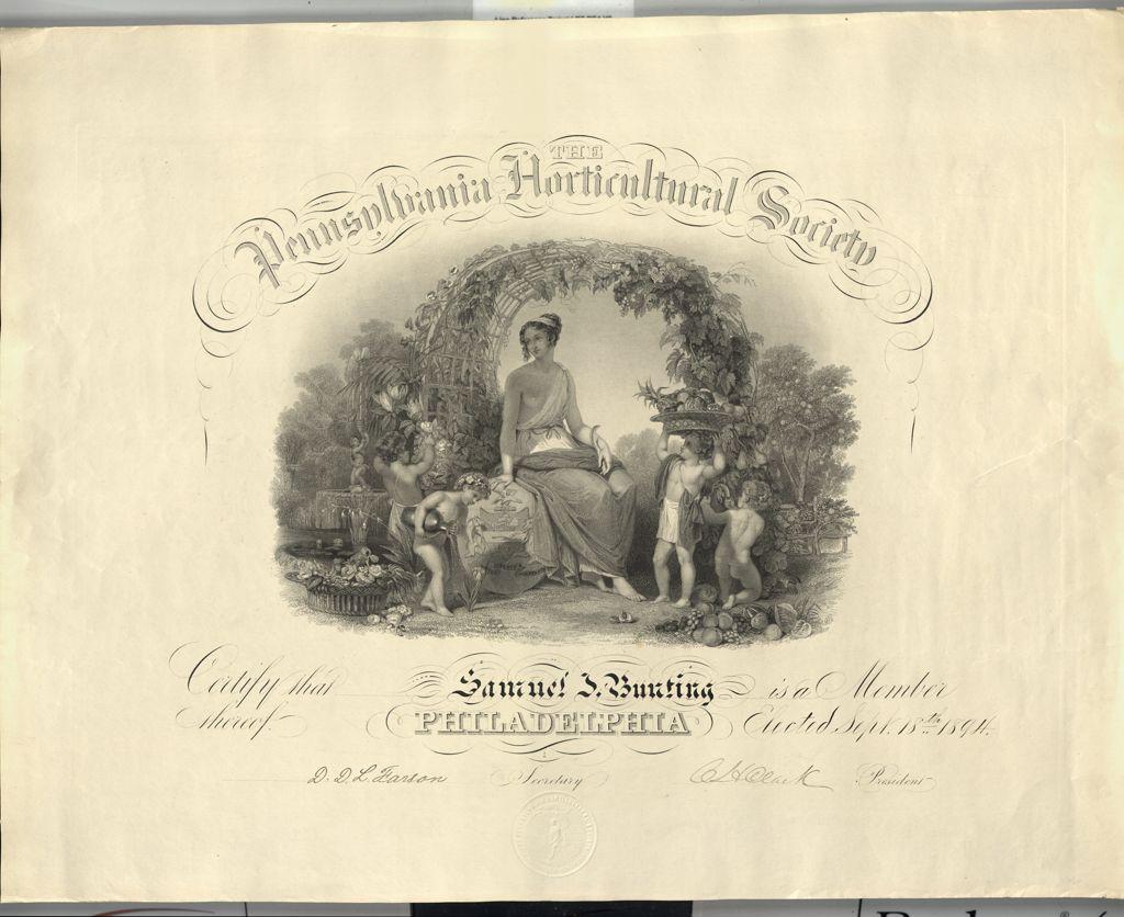
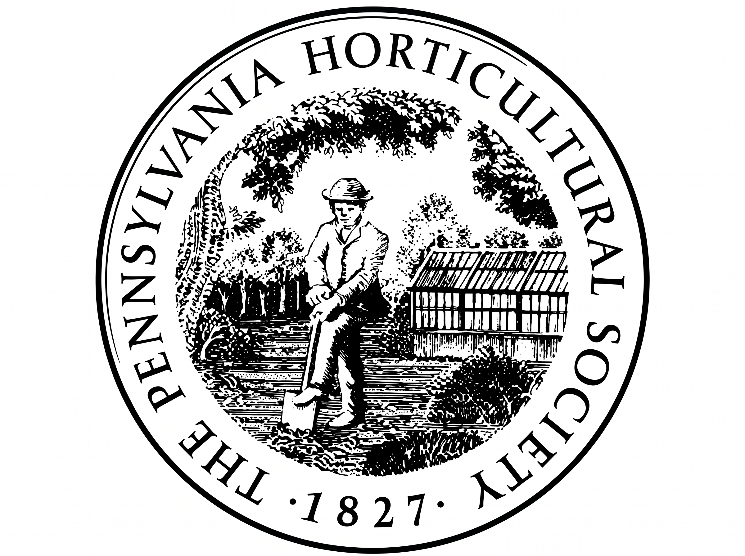
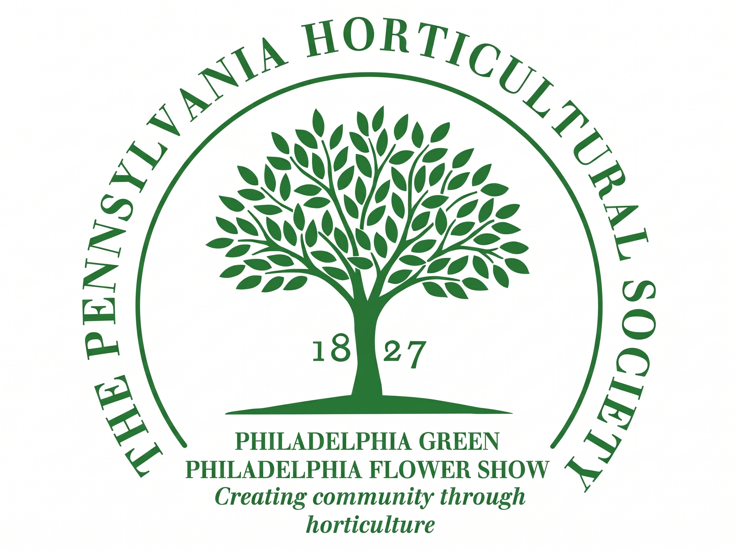
Each of these symbols reflected something about PHS at a particular moment in its history. But as PHS’s role in Philadelphia expanded, its identity needed to tell a larger story.
Why a New Identity?
As PHS approached its 200th anniversary, the development of its new Third Century Strategic Plan prompted an important question: How could the organization build greater awareness of its work and inspire more people to become part of its mission?
The opportunity was especially clear in the gap between what people knew about PHS and the role it played in their daily lives. The Philadelphia Flower Show was widely recognized, but the organization’s contributions to neighborhood greening efforts and public gardens and landscapes across Greater Philadelphia were not always associated with the same institution.
The challenge was to create a visual identity that could make those connections more apparent while remaining flexible enough to represent the many dimensions of PHS.
“People know the Flower Show, but they don’t always realize how much of PHS’s work happens right in their own neighborhoods,” said Rob Feinberg, PHS Chief Marketing, Communications and Sales Officer. “We wanted an identity that would help people make that connection and see PHS as part of their everyday lives.”
So, the organization set out to reinvent the brand to allow it to better reflect PHS’s evolving role and make its mission more recognizable to the people and communities it serves.

Designing the Next Chapter
To craft this new brand, PHS worked with Philadelphia-based creative studio Smith & Diction. The process involved nearly a year of collaboration with PHS staff, leadership, board members, and stakeholders. Together, they explored how the organization’s history, horticultural expertise, and connection to Philadelphia could inform a new visual language powerful enough to take PHS into its next century and beyond.
“The work that PHS does is truly incredible,” says Chara Smith, co-founder of Smith & Diction. “They are a world-class organization, so we wanted to give them a world-class brand. We wanted to give them a brand that felt as beautiful and diverse as the gardens they tend, as inviting as the neighborhood efforts they host, and as showstopping as the Philadelphia Flower Show.”
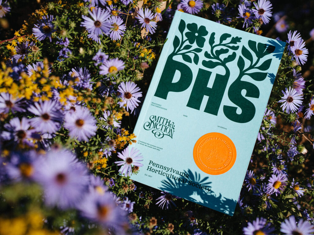
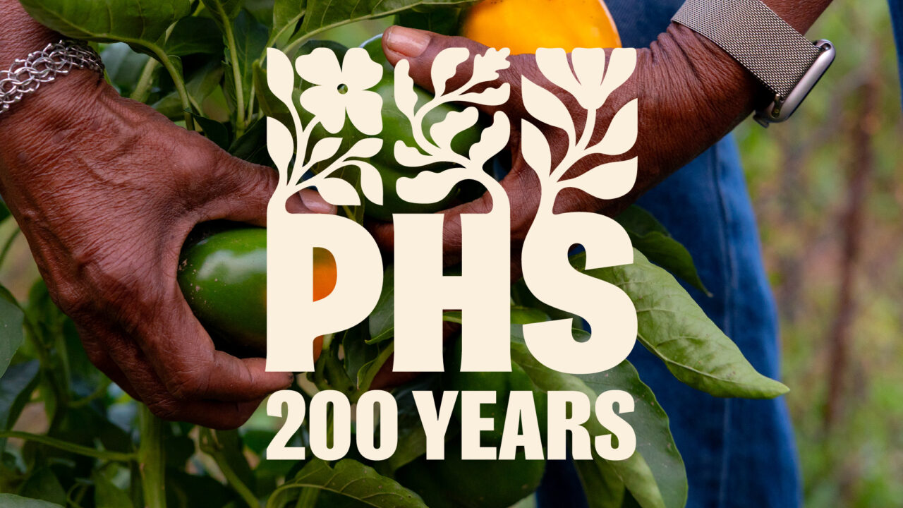
The brand centers around a new wordmark—a custom “PHS” with three distinct plants growing upward from the letters. Rather than relying on a single botanical symbol, the design embraces the variety of the plant world, creating an immediate connection that places gardening at the heart of PHS’s mission. The forms feel alive, poised to sway in the wind, with PHS’s name as a foundation where good things are taking root. The arrangement of plants also references Philadelphia’s street grid, grounding the imagery in the city where its members first gathered in 1827.
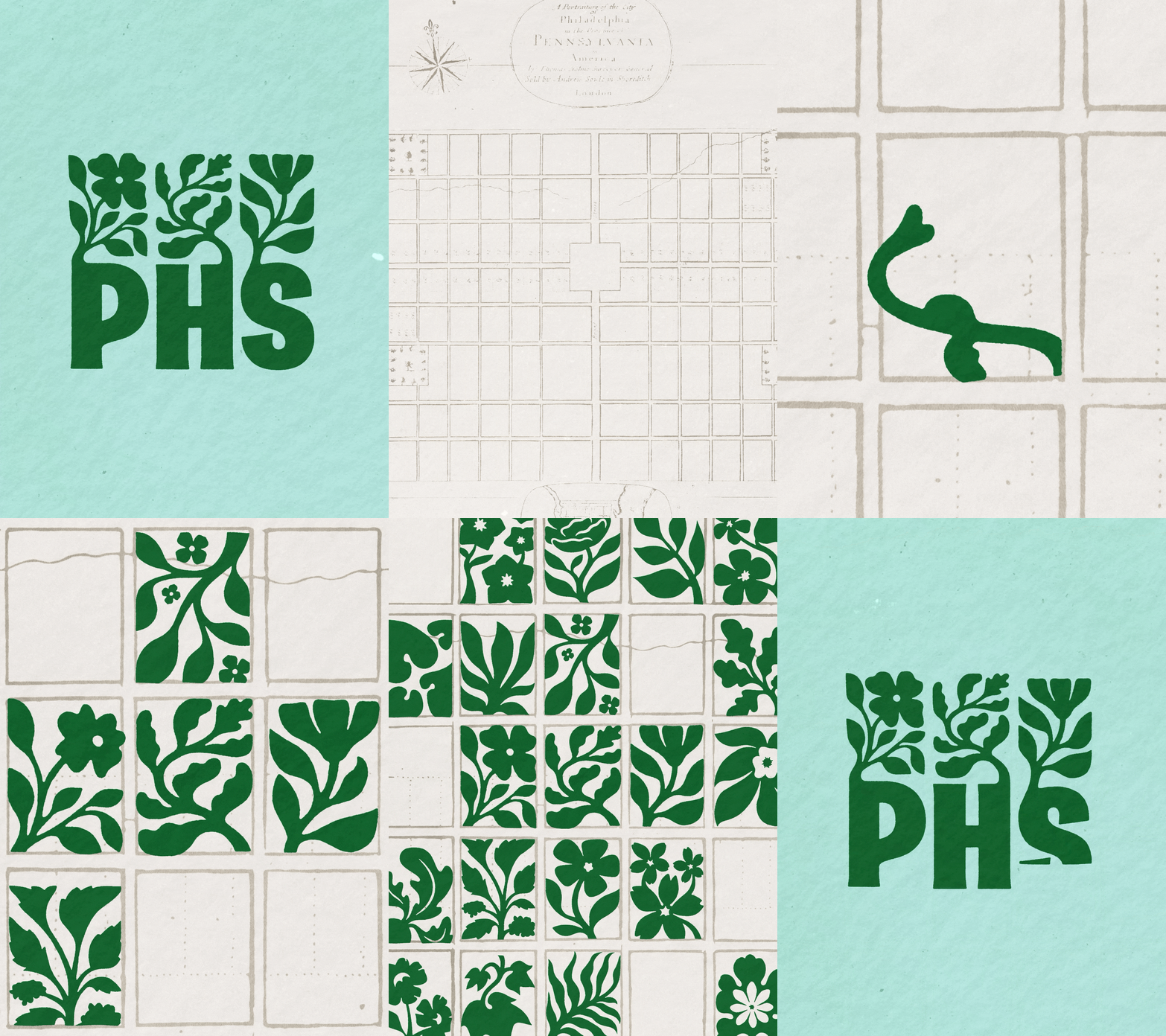
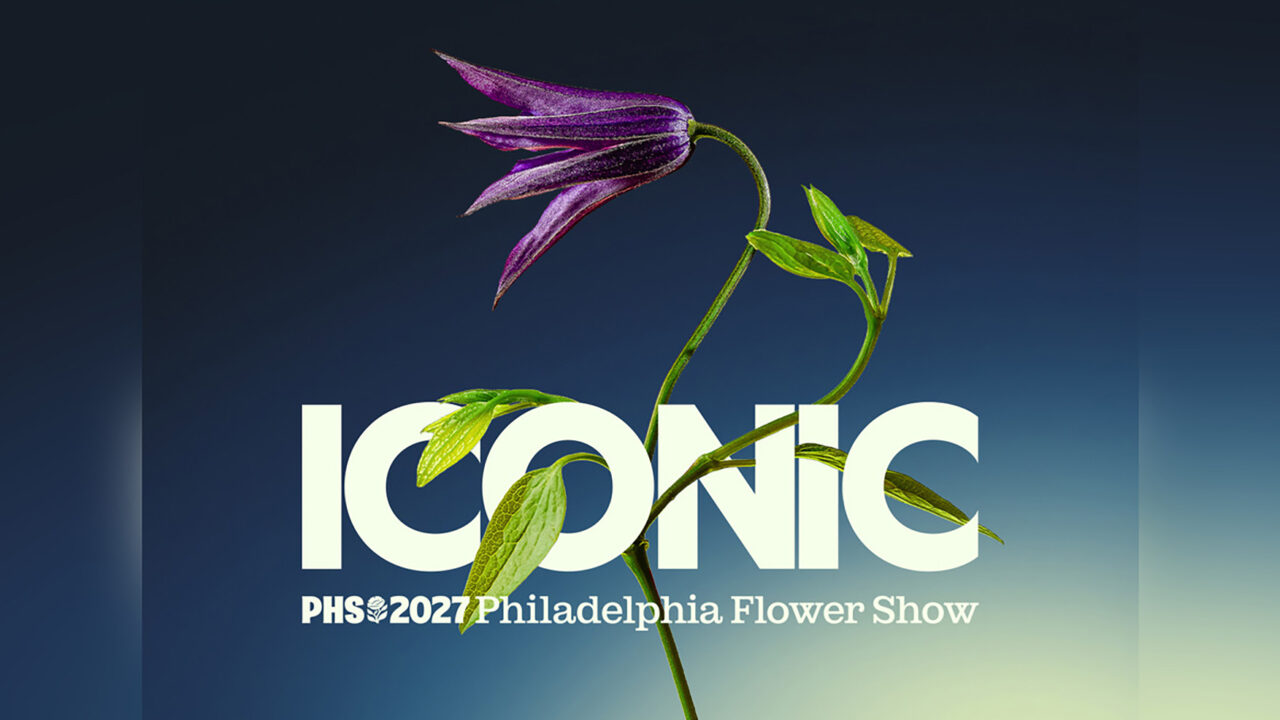
But the brand extends far beyond the logo itself. An expanded color palette draws inspiration from the broad diversity of colors in nature. A suite of custom, hand-drawn botanical illustrations helps convey the breadth and dimensionality of PHS’s work, from neighborhood greening initiatives to the Philadelphia Flower Show. The brand system also makes room for a more expressive side of PHS. Its
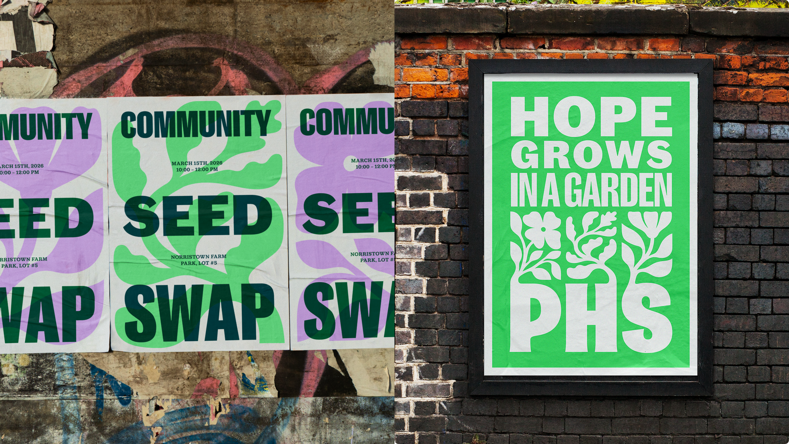
“This brand was not a simple one to craft,” says Smith. “The organization does so many different things; we needed a brand that could stretch and flex and bend to feel at home whether it was representing a local community garden or on a world stage. So from color, to typography, to illustration, we set out to give the team at PHS a diverse toolkit that allows them to meet all their different audiences, while always tying back to the same core brand and feeling.”
The design is intended to make something increasingly clear: PHS is more than a Flower Show, a gardening resource, or a collection of community greening programs. It is an organization that brings people together through gardening to improve the places where they live. The refreshed identity makes those connections more visible, giving PHS a consistent presence across its many activities while also preserving the individuality of each effort.